Tourism and Community Signage Strategy
Ideas Wall
My idea for an iconic town image is.....
GG
- USE BRIGHTER COLOURS
- Proposed use of colours needs revisiting. Brown is drab and as others suggest tends to reflect drought not lush tropics. Greens are basic but consider reds and blues for example as in blossoms of numerous native and exotic trees. How about gold and yellows (maize, sunshine etc). The emerald green is not one I would readily associate with lush rainforest with its multiple shades of green we see around us. Use a modern sans serif font and do something artistic with it (vertcal presentation ?)
GAS
- Ask the community for their ideas
- Each sign is drab, uninspiring, does not reflect our country colour or people. Ask the people to give ideas and then we vote on what represents us! Respectfully these are shocking. Please ask the people to share their art work and allow the people to vote in their respective town.
Stuart Withrington
- Have a variety of images to vote on before designing
- Look down to Michelle J's posts - lots of images there, but we can't vote on individual ones. It's good to have a theme to link them, but the Tablelands is a group of VERY distinct townships so their character needs to come through more strongly. I understand that coreten won't look as dull as the brown suggests, but the theme is wrong - should be lush green with hint of brown, not dull brown with a hint of teal. Even then, Herberton is rocky sand, not brown or green!
Stan Beattie
- Individual town signs, Vibrant welcoming
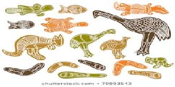
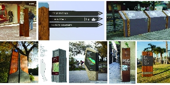
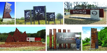
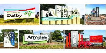
- Whilst there is a small advantage in all the signs being similar it should in no way sacrifice the individuality of the particular town. The signs should be vibrant and welcoming ( the proposed signs are not) We have soo much beauty all around as and the signs need to capture the beauty of the individual town and draw people in. the mural on the Eacham Hardware wall would be a good start for Malanda, or something like this attached image
Don
- Colour used in signage
- We are a vibrant community, people think of the Tablelands and think green. People do not think of brown (drought is brown) Have a more vibrant colour, ditch the brown (or whatever colour it is) go vibrant and alive
Georgie
- Rainforest green crops. Outline of Bartel Frere is our shape.
- No Brown not only does it look awful and nothing like the shapes up here on Tablelands but ploughing is going out fast and the worst thing you can do to the soil is to plough it and leave uncovered. Leaves it open to compaction, erosion, runoff, loss of topsoil and loss of humus and soil food web. So why would we use it as our symbol!!!? Also why was there no space to not agree on survey??? Get rid of them all and get local artist to do something.
JJ
- Brighter colours that are happy and inviting
- We are a tourist destination. The brown is depressing and ugly and does not reflect the beauty of the Tablelands. Please don’t use these signs, each town should be unique, get the chamber of commerce involved for ideas on each town. The signs should make you feel like smiling when you come into a town, these signs are terrible, please don’t go ahead with them.
Maree
- Please make more unique
- I'd rather see each town have a unique sign. Having them all match makes me feel like I'm living in a suburb not a town/village. Each town has more unique characteristics then can be summed up by an 'identifier'. Agree with others that the colours are lacklustre and what about other towns not shown here.
Pamela
- Way too much brown/ochre ..
- In the voting system for colours, there should have been an option for "Don't like". The blue for the falls at Millaa Millaa is good, but should be used in conjunction with lush green. Malanda should have lush green and incorporate the brown by reversing the land stripes and for the Tree Kangaroo. Indigenous culture celebrated better with a symbol that they identify with. Definitely more definition in foliage. Pale colours OUT with strong vibrant colours used.
Leah
- Atherton Tableland is vibrant and lush: lets show this when we promote the area
- The Atherton Tablelands is known for its great farming land and rainforests. We are one of the few places that aren't in drought, but these images look like we are also draught. The images could show lush colorful landscapes. Graphic designers tend to discourage images behind words- it's harder to read. Also, there is a silhouette of the man on the left and half a car in the images on the right. I don't think they add anything positive to the images.
slcurcio
- Towns Overlooked
- Why are there no signs proposed for Kairi, Tinaroo, Tolga or Walkamin? Kairi - maize silos Tinaroo - dam wall or lake Tolga - Rocky creek igloo, peanuts & maize Walkamin - the channel Its a bit insulting that those towns have been totally overlooked...or are they too "agricultural" to promote to tourists??
Britt
- Vintage Postcards - Perfect for Selfie Promotion!
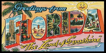
- As a graphic designer myself, I find these lack vitality, colour, and reflection of the towns. The colour scheme should be bright as a start! Perhaps instead of trying to do a modern look which will date quickly, go much more vintage in style! You could even do a "Greetings From ..." Postcard look which will be a great spot for visitors and locals to take a selfie and promote our region to their friends.
Kirsten
- remove or redesign 'rainforest' from signage
- the foliage on the bottom left of the signs is just a colour blob. The metal work should/could have a lot more detail/definition so it actually looks like foliage. The colour is totally non-representational. Overall, i like the simplicity of the signage but there is so much blue in the palette, ...when in our environment there is so much green.....That doesn't seem to make a lot of sense.
WW
- WATERFALL SIGNAGE
- BIGGER signage required on the Palmerston Hwy, directing tourist to Millaa falls and the Waterfall circuit. NEW signage in Main Street Millaa directing tourists that the FALLS are NOT ACCESSABLE from the town. Current sign too small and in the wrong location on Main St. NEW signs required at the intersection of the Palmerston and Theresa Creek Road facing both ways, directing traffic to the falls circuit. New signage required on Theresa Creek Road notifying traffic of SINGLE lane road [narrow]
Kate Eden
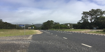
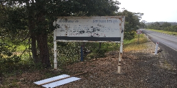
- Opposite the Wild River Caravan park in Herberton would be a good location for a town map sign
- People often think that the Historic Village is the village of Herberton and don’t think to continue through to town after visiting the museum. An entrance sign with a map or a list of services or something to indicate there is a town here would be helpful and this would be a good location to pull over to have a good look.
Kate Eden
- Include website info on entrance signs and update old website info
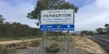
- The entrance signs to Herberton have a blue sign below with www.herberton.qld.au which is no longer functioning. There is a website for Herberton and the new business group will either be making a new one or updating the old, so when that is in place, the signs need to be updated.
Lynne
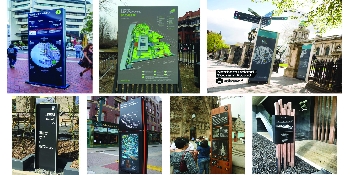
- Community Boards with map for tourists
- I propose signage boards, that welcome tourists with a "you are here" message and local map, showing points of interest for tourists. The boards could be placed at the various TRC Visitor Information Centre carparks.

_1575629376.jpeg)

